Barrow Neurological Institute
Barrow Neurological Institute has the world’s leading team of neurosurgeons and neurological specialists, providing advanced brain and spine treatment options and the highest levels of patient care. Barrow and emagine have had an ongoing 5+ year relationship, which provided a level of trust and expertise to undertake a digital project of this size, take measured risks to create amazing new features and launch on schedule. In the latest website for Barrow, we aimed to provide a world-class website to reflect their prominence in the world of neuroscience.
emagineHealth and Barrow were honored to accept the 2021 Modern Healthcare Award for this important project. The Barrow and emagine teams were determined to make this website truly patient-centric with an emphasis on the patient journey, as demonstrated front-and-center on the home page. Because Barrow is an academic institute, this was not an easy feat.
View the award-winning website here: https://www.barrowneuro.org/

The Patient Journey
Through our discovery process, we found many different reasons to visit the Barrow site and came to ask one key question that is featured prominently on their homepage: “Where are you in your journey?” Patients and caregivers coming to Barrow from the greater Phoenix area, or looking to travel for specialty treatment, have different needs – and the content directs the user per their needs, whether they were recently diagnosed, looking for second opinion, soon to have surgery, receiving outpatient services or rehab, or are interested in philanthropy.


With sub-specialized centers and programs in each neurological sub-specialty, Barrow offers a vast amount of resources for patients and families. emagine built the site to help users stay on the best path for each user’s unique content needs. A patient searching for a particular treatment or condition are easily able to find the content that is most relevant. Each center or program becomes also like a microsite – each with a clear and concise sub-menu to provide the patient with a better user experience.

Included in the project was a robust undertaking of a 3D movable map that re-orients itself depending on which center of the site you are visiting. Barrow had a geographical challenge in helping patients arriving at the center in finding the proper building. emagine designed, 3D-modelled, and developed a searchable map allowing patients to easily look for the right building, center, or physician. No matter which center the user is visiting on the site, the map orients itself automatically to guide the user to their destination on the Barrow campus.
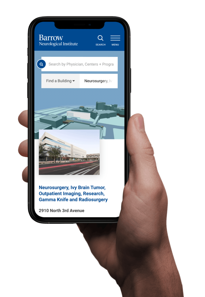


Because of the vast amount of content, the new site had to offer robust search offerings to make the right content easy to find, and to give Barrow the control to rank certain content. We provided a search solution that allowed us to create custom tools for the site such as Find a Doctor, and a clinical trial search tool. Find a Doctor allows patients to find the right physician for them by condition and specialty, department, and insurance type. The finder also allows the patient to read the doctor’s biography pages, which each includes key stats in a beautiful design about their surgeries, research and articles, and experience. The clinical trial search tool allows patients to search through more than 300 clinical trials by condition and guides them through the process of getting involved.
Both search tools are flexible enough to grow as Barrow adds new conditions, doctors and trials, and can be adopted anywhere on the site, allowing for the website to grow with future changes.

The site was built according to the WCAG 2.1 Level AA standards for web accessibility. These standards are recommended for all sites on the web, but as a neurological hospital with a wide range of users accessing the site, it was especially important to have an equitable web experience for all users. This accessibility includes a color palette with a 4.5:1 color contrast ratio for text. These standards also set forth guidelines to optimize the site for users with screen readers, users with dexterity and mobility needs, and users prone to seizure. emagine designed the site with these guidelines in mind from the start, and then retested the site close to launch to make any necessary edits before the site went live.

emagine backed up the homepage recommendations for Barrow with data derived from real user testing. Before presenting any wireframes or concepts to Barrow, emagine performed a series of tests to ensure the logic behind homepage order. With this data in hand, Barrow was able to present a case to all members of the web committee to validate the design decisions and move forward with a tested best option. Post-launch, we followed up with a scavenger hunt with the users to ensure the site was user-friendly, easy to navigate, and behaved as a new user to site would expect it to work.


